
Let’s be honest. Just throwing protein, starch, and veggies on a plate is like reading a boring report. It’s necessary, but it doesn’t inspire.
My philosophy asks a bold question. What if your dinner plate was a canvas and you were the artist? Imagine your meal as a Caravaggio painting, full of depth and emotion.
Italian cuisine can go beyond just food. It can tell a story through visuals. The firm pasta and smooth sauce create a beautiful contrast on your plate.
In places like Camperdown Elm, plating is seen as a “captivating dance”. It’s where design meets taste. Scientist Charles Spence agrees, saying “when the plating is artistic, people tend to enjoy the food more.” An artful arrangement turns eating into an experience.
This isn’t just about looks. It’s about design. We see food first, and good presentation makes a big difference. It turns a meal into a memorable moment, like a symphony.
Balance of restraint and creativity
The biggest challenge in food presentation today is finding the right balance. It’s about showing off your skills without overdoing it. Imagine a friend who talks too much on a first date versus one who leaves you wanting more.
Some dishes are so simple, they feel like a design lecture. Others are too busy, like a child’s art after eating too much sugar. The key is finding that sweet spot.
True mastery comes from editing. It’s not just about arranging food; it’s about choosing what’s most important. A few well-chosen elements can outshine many random ones. A sprig of microgreens adds a touch, while a drizzle of sauce guides your eye.
Chefs often treat their plates like canvases, focusing on every detail. But they also keep things simple and beautiful. My goal is to create comfort, not confusion.
Decisions like whether to use symmetry or asymmetry are key. Symmetry looks formal, while asymmetry adds life. It’s like the difference between a formal photo and a candid shot.
The idea of wabi-sabi, finding beauty in imperfection, is perfect here. A slightly off-center herb leaf adds a human touch. A deconstructed dessert shows creativity and emotion.
My rule is to edit with confidence. If you’re unsure about an element, it probably doesn’t belong. The empty space on the plate is like the silence between notes, making the dish complete.
This philosophy goes beyond the plate to culinary artistry. Every choice should enhance the whole dish.
Finding the right balance in food presentation is all about feeling. It’s knowing when to add the final touch and when to stop. The best presentations have few, well-chosen elements. What you leave out is just as important as what you put in.
Color and texture contrasts
Great plating is all about visual pop and textural drama. It’s like culinary jazz, where rules are broken beautifully. Your plate is a conversation starter, not just a picture.
Color theory is key, not just for painters. A green basil oil under pink vitello tonnato grabs your attention. Our brains love contrast, like red and green at Christmas. A guide to plating shows how colors can make food look more appealing.
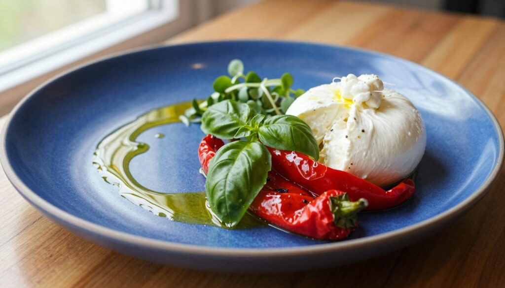
Warm colors also play a role. A curry with reds, oranges, and yellows feels cheerful. It’s color psychology on your plate. The way shrimp are arranged adds visual rhythm.
Texture is the unsung hero of artistic plating. Color is the melody, texture the rhythm. A plain beige plate is dull. We crave contrast in taste as much as sight.
Think of a single bite as a story. A fried artichoke leaf’s crunch gives way to its soft heart. This sits on smooth white bean purée. It’s a three-act play in your mouth.
Chefs create edible landscapes. Toasted walnuts meet whipped goat cheese in a mix of crunch and cream. It’s not just decoration. It’s sensory engineering.
A plate with only one texture is dull. The goal is to mix crunch, smear, and tender pull. All working together.
| Contrast Type | Technique | Example | Sensory Effect |
|---|---|---|---|
| Color Complementary | Place opposite colors on color wheel together | Red pepper coulis under green herb oil | Creates visual excitement and “pop” |
| Color Harmonious | Use adjacent colors on color wheel | Yellow squash, orange carrot, red pepper medley | Evokes warmth and comfort |
| Texture Crunchy/Tender | Pair crisp elements with soft components | Crisp halibut skin with tender flesh and creamy sauce | Provides mouthfeel variety and interest |
| Temperature Contrast | Combine warm and cool elements | Warm seared scallop on chilled apple slaw | Surprises and delights the palate |
The pan-seared halibut is a perfect example. It has crisp skin, tender flesh, and creamy sauce. Each texture enhances the others. The roasted beet salad is another example, with earthy, crunchy, and velvety textures.
This approach to artistic plating makes eating an experience. It’s not just about feeding someone. It’s a journey with each contrast being a landmark.
Remember, a symphony is all about different instruments playing together. Your plate should have the same dialogue between elements.
Mastering these contrasts makes cooking an art. It’s the difference between just eating and having an experience. Guests might not notice the color wheel or textures, but they’ll feel and remember it.
Seasonal presentation changes
The most honest plate tells you what month it is before you even taste a bite. Serving a hearty, dark stew with a fussy, delicate garnish in summer is a lie. Your food presentation should be the most reliable calendar in the room.
Summer on a plate isn’t just tomatoes and corn. It’s a feeling. The presentation should feel loose, abundant, almost sun-drenched. Imagine herbs scattered with a generous hand. Picture a bright, unstructured salad tumbling off to the side. This isn’t carelessness; it’s curated casualness.
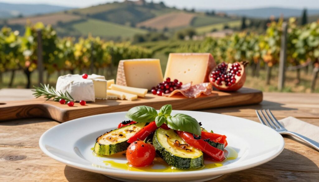
Now flip the calendar to autumn. The composition tightens. Colors deepen toward earth tones—burnt orange, forest green, deep brown. Ingredients gather closer together, like mushrooms huddling on a forest floor. There’s a sense of gathering, of preparation. This contrast isn’t arbitrary. It’s the culinary equivalent of swapping linen suits for wool coats.
This is where seasonal food presentation isn’t just pretty—it’s authentic. Source 1’s spring asparagus dish, arranged to evoke a “lush, verdant garden,” is the perfect example. It doesn’t just contain spring ingredients; it looks like spring feels. That dry-aged duck breast? Its plating tells a story of provenance, of time spent developing flavor. A winter squash ravioli in February needs a plating that acknowledges the chill outside, not a sprightly garnish that promises April.
When your food presentation adapts to the season, you stop being just a cook. You become a curator of the moment. You’re not serving dishes; you’re serving a narrative of time and place. It’s the difference between a static museum exhibit and a living, breathing ecosystem on a plate. The commitment isn’t to a style, but to a truth—one that changes every few months.
How plating enhances flavor perception
Are we just Instagram zombies chasing pretty plates? Science says no. Oxford’s Charles Spence proved it: our brains taste with our eyes first. A beautiful plate isn’t just decor. It’s neural priming.
It sets an expectation of quality that your palate races to meet.
This is the psychology of artistic plating. It’s a visual story that adds meaning to each bite. When components are arranged with intention, they whisper care and respect. That message gets baked into your flavor perception.
A cluttered plate screams chaos. A balanced one promises harmony.
Studies on visual symmetry show it can make identical food taste sweeter. That’s the power of expectation. Thoughtful artistic plating is the ultimate placebo effect you can eat.
It’s the unpaid, invisible ingredient that transforms protein and starch into a narrative. The final flavor is always a collaboration between the kitchen and your own biased, hopeful brain.