

Let’s go back in time. Before the Instagrammable lemon walls and sculptural boars, American dining rooms were different. The original idea wasn’t about being real—it was about perception.
Imagine immigrant nostalgia for a homeland that was often more dreamy than real. Places like San Francisco’s Fior D’Italia, which opened in 1886, set the stage. Their decor hinted at a simple, romantic Italy you could visit without leaving the country.
Early designs included murals of vague, pastoral scenes—a 17th-century art tradition used in American diners. Red-and-white checker tablecloths, family photos, and sturdy wood chairs added to the scene. Art critic Ben Davis says these murals show “‘Italianness’ distilled to this really easily digestible, magical, nostalgia thing.”
Places like Tosca Cafe (1919) mastered this cozy, theatrical feel with lacquered booths and soft lighting. This wasn’t about modern italian restaurant design. It was about creating a warm, inviting stage set for a new American experience. That storytelling through decor? It’s the DNA we’re working with today.
Modern vs traditional aesthetics
The world of Italian restaurant design has changed a lot in 20 years. In the early 2000s, we saw sleek, quiet spaces. Now, we have vibrant, lively places that feel like a party. This change is more than just new decor; it’s a shift in culture, seen in terrazzo and glass.
Remember Flour + Water from 2009? It was all about clean lines and calm. I Sodi in 2008 was even quieter, with a focus on simplicity. Via Carota in 2014 brought a rustic touch, with exposed brick and wood. These places were a reaction against old clichés, introducing new modern Italian design principles.
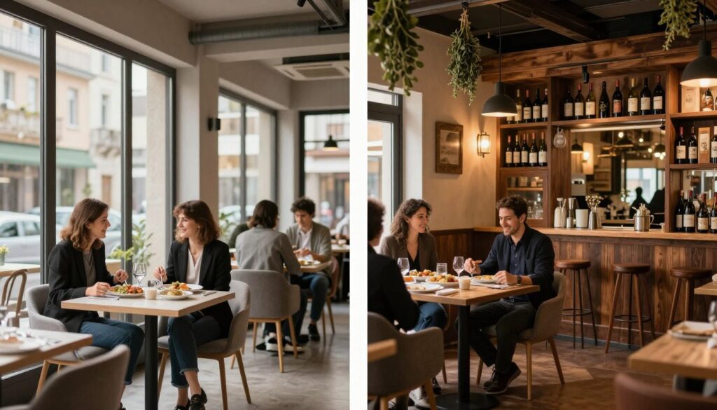
Now, after White Lotus and the pandemic, we see a new trend. Designer Hannah Collins says maximalism is in, and Italians do it best. Bad Roman (2023) is a prime example, with its bold decor and sculptures. Corzetti also stands out, with its bright colors and Ferrari-red accents.
So, what’s behind this change? We’ve had enough of minimalism and now crave something more. The old minimalist phase celebrated simplicity and authenticity. Today’s maximalism is all about fun and escapism, as author Ian McAllen points out.
The Minimalist Manifesto: Less as More
The early 2000s were all about simplicity. This wasn’t just about looks; it was a philosophy. The focus was on the food, not the decor. Think of it as a stage where the food was the star.
This shift towards simplicity was part of a broader trend towards authenticity in dining. You can see this evolution of Italian restaurant design from ornate to simple.
- Flour + Water (2009): The blueprint. Clean lines, Italian marble, an almost Scandinavian calm.
- I Sodi (2008): Monastic and warm. Cream walls, brown leather, zero distractions.
- Via Carota (2014): Rustic modern. Exposed bones, natural materials, humble elegance.
The Maximalist Counter-Reformation: More is More
Now, the pendulum has swung back. Today’s maximalism is not just about being loud. It’s a thoughtful mix of Italian culture and modern style. It’s about blending old and new in a creative way.
This new style is all about feeling and joy. It’s not just about eating; it’s about experiencing something special. The interiors are now the main attraction, with every detail telling a story.
| Aspect | Minimalist Approach (Early 2000s) | Maximalist Approach (Today) |
|---|---|---|
| Philosophy | Ingredient as hero, space as neutral canvas | Experience as hero, space as immersive theater |
| Color Palette | Neutrals, earth tones, monochromatic | High contrast, bold accents, layered patterns |
| Materials | Natural stone, raw wood, exposed elements | Mixed metals, textured wallpapers, artisanal glass |
| Cultural Driver | Authenticity, craftsmanship, purity | Escapism, joy, post-pandemic celebration |
This change shows how we use restaurants has evolved. They’re now places for experiences, photos, and temporary escapes. The italian restaurant design today knows how to make us feel alive and excited.
The beauty of today’s modern Italian design is its balance. It feels both timeless and fresh. It honors history but also looks to the future. This is design that’s both smart and fun.
So, which style wins? The answer is both. Minimalism taught us to value simplicity and restraint. Maximalism brings joy and fantasy. The best designs today blend both, creating spaces that are smart and full of life.
Materials and textures
Forget what’s on your plate for a moment. The real story of italian restaurant design is in what you touch.
Early places knew texture meant comfort. Think of Tosca Cafe’s strong wood chairs that soaked up years of talks. Their booths had thick lacquer, and black-and-white tiles were cool under your feet. These weren’t just for looks; they were forgiving. They took spills, muffled sounds, and aged well.
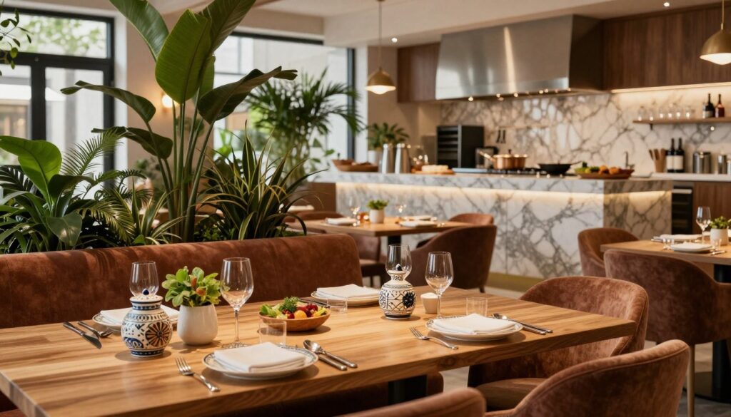
The 1980s changed everything. It was all about making a statement. Spiaggia’s green marble columns were bold. Marble was like a power suit—shiny, strong, and hard to ignore.
Then, things got simpler. Places like Flour + Water and Via Carota went for honesty. They used raw brick and honed marble. Natural wood floors brought things back to earth. This was modern italian restaurant design at its best—letting materials speak for themselves.
Designer Gavin Knowles got it right: “We picked simple materials to show off their makers’ hands and age beautifully.”
Now, it’s all about mixing textures. It’s like a library where every touch tells a story.
Trompe l’oeil mosaics trick your eyes. Iridescent tiles at Marisi shine like alien scales. Wood at Corzetti looks like Ligurian boats. Schumacher’s wallpaper brings the outdoors in. It’s not messy—it’s curated chaos.
Layering material stories adds depth. Mixing rustic wood with marble. Rattan with futuristic tile. Each mix adds to the story.
Think of Bad Roman in New York. It’s not just about looks—it’s about feeling before you even eat.
| Material Era | Key Materials | Design Philosophy | Example Restaurants |
|---|---|---|---|
| Early Traditional | Sturdy wood, lacquer, checkerboard tile | Comfort and durability | Tosca Cafe |
| 1980s Decadence | Green marble, polished surfaces | Opulence and power | Spiaggia |
| Modern Minimalist | Raw brick, honed marble, natural wood | Material honesty and craftsmanship | Flour + Water, Via Carota |
| Contemporary Maximalist | Trompe l’oeil, iridescent tile, sculpted wood | Curated sensory experience | Marisi, Corzetti |
This evolution shows us italian restaurant design has changed. Early designs were about feeling. Today, they’re about reading the materials.
Every surface tells a story. Marble speaks of class. Wood whispers tradition. Iridescent tile shouts newness. In today’s modern italian restaurant design, these stories blend together.
Your hand on the tablecloth. Your glass on the marble. Your eyes on the mosaic. This is how Italian restaurants create atmosphere—layer by layer.
Color palette philosophy
If the red-checked tablecloth was the universal flag of Italian dining, today’s color palettes are speaking in distinct regional dialects. We’ve moved from the color of memory to the color of specific place. This shift isn’t just aesthetic—it’s a fundamental change in how restaurants communicate identity.
The original philosophy was safety. Earthy tones, natural shades, that iconic red-and-white gingham. It wasn’t about design innovation. It was about creating a familiar, comforting symbol. You saw the check, you thought pasta. Simple. For informal spots, bright walls in cool greens or blues aimed to visually expand cramped spaces. Fine dining went the opposite way. Dark, warm hues and crisp white linens built intimate cocoons for conversation.
Then came the great minimalist purge. A wave of sandy beiges, creams, and greiges washed over italian restaurant design. Sophisticated? Sure. But also, let’s be honest, a bit hospital-adjacent. The philosophy was restraint, letting food be the only star. Places like I Sodi mastered this reserved elegance.
The current revolution is maximalist and gloriously specific. Color is now a precise narrative tool, not a vague symbol. It’s not “red”—it’s Ferrari-red, a jolt of automotive passion on a banquette. Not “yellow,” but the acid-bright lemon of a Ligurian coastline plastered across a wall. This approach, seen in projects like Infinity Atelier’s work, uses color to pinpoint geography and emotion.
| Design Philosophy | Characteristic Colors | Spatial Effect | Emotional Tone |
|---|---|---|---|
| Traditional Heritage | Earthy browns, terracotta, red & white check | Familiar, grounded, unpretentious | Nostalgic, comforting, safe |
| Modern Minimalism | Beige, cream, greige, muted brown | Clean, expansive, serene | Sophisticated, calm, sometimes sterile |
| New Maximalism | Ferrari-red, Amalfi lemon-yellow, coastal green | Energetic, immersive, destination-specific | Joyful, passionate, escapist |
This new philosophy treats color like a regional ingredient. A striking emerald green upholstery doesn’t just look good—it whispers “Amalfi Coast.” A vibrant print of citrus isn’t just pattern; it’s a postcard from Lake Como. The interiors are doing the visual equivalent of speaking in a thick local dialect instead of textbook Italian.
The impact on the dining experience is profound. Dark, intimate hues in a fine-dining room slow time down. They encourage leaning in. The explosive, citrus-bright palette of a place like Marisi’s Lemon Room? That’s pure, unadulterated exuberance. It makes you sit up straighter, talk louder, feel the vacation vibe. This thoughtful use of hue directly influences the atmosphere, much like considered plating elevates a dish.
The ultimate shift is philosophical. We’ve abandoned the quest for a generic “Italian” feel. Today’s color stories aim to trigger a specific, deeply desirable Italian fantasy. Are you in a moody Tuscan villa or a sun-drenched Positano terrace? The walls now answer that question before you even see the menu.
Translating Italy into space
So, how do you bottle a country’s soul? The old way was to use literal designs. Think murals of hills, plastic grapevines, and a Vespa in the corner. It was like a postcard, charming but obvious.
The modern approach is different. It’s about creating something new from fragments. Architect Rus Mehta of GRT Architects calls it “something new” from parts. Places like Bad Roman offer a remixed view of Italy, seen through a global lens.
This new way changes how interiors are designed. It’s not about being exact. It’s about feeling. Imagine Picasso, not a postcard.
Al fresco dining might be the most authentic way. It brings the outdoors in. Teak tables, rattan chairs, and string lights give you that Roman patio feel. It shows the best Italian space isn’t always indoors.
The real goal is to create an experience. Great Italian restaurant design is about joy, talking, and beautiful art in a space. Modern interiors focus on the spirit, not just the scenery.